Composing the User Interface Using the Prism Library for WPF
A composite application user interface (UI) is composed from loosely coupled visual components known as views that are typically contained in the application modules, but they do not need to be. If you divide your application into modules, you need some way to loosely compose the UI, but you might choose to use this approach even if the views are not in modules. To the user, the application presents a seamless user experience and delivers a fully integrated application.
To compose your UI, you need an architecture that allows you to create a layout composed of loosely coupled visual elements generated at run time. Additionally, the architecture should provide strategies for these visual elements to communicate in a loosely coupled fashion.
An application UI can be built by using one of the following paradigms:
- All required controls for a form are contained in a single Extensible Application Markup Language (XAML) file, composing the form at design time.
- Logical areas of the form are separated into distinct parts, typically user controls. The parts are referenced by the form, and the form is composed at design time.
- Logical areas of the form are separated into distinct parts, typically user controls. The parts are unknown to the form and are dynamically added to the form at run time. Applications that use this methodology are known as composite applications using UI composition patterns.
Below is a picture of an app. It is composed by loading multiple views that come from different modules into regions exposed by the shell, as shown in the following illustration.
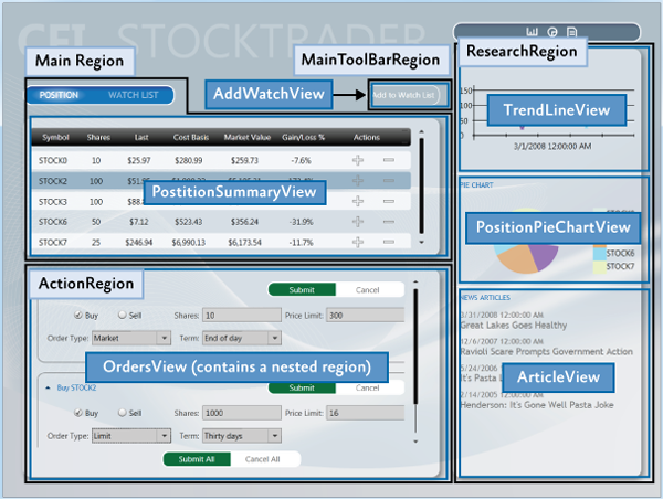
UI Layout Concepts
The shell is typically the main application window and it is comprised of regions. Regions are mostly contained within ContentControl's, ItemControl's and TabControl's, and the shell has no knowledge of what is implemented in the region. Inside the region are views. The view is the implementation of a specific portion of the UI and is decoupled from other parts of the application.
The following sections introduce the high-level core concepts for composite application development.
Shell
The shell is the application root object that contains the primary UI content. In a Windows Presentation Foundation (WPF) application, the shell is the Window object.
The shell plays the role of a master page providing the layout structure for the application. The shell contains one or more named regions where modules can specify the views that will appear. It can also define certain top-level UI elements, such as the background, main menu, and toolbar.
The shell defines the overall appearance of the application. It might define styles and borders that are present and visible in the shell layout itself, and it might also define styles, templates, and themes that will be applied to the views that are plugged into the shell.
Typically, the shell is a part of the WPF application project. The assembly that contains the shell might or might not reference the assemblies that contain the views to be loaded in the shell's regions.
Views
Views are the main unit of UI construction within a composite application. You can define a view as a user control, page, data template, or custom control. A view encapsulates a portion of your UI that you would like to keep as decoupled as possible from other parts of the application. You can choose what goes in a view based on encapsulation or a piece of functionality, or you can choose to define something as a view because you will have multiple instances of that view in your application.
Because of the content model of WPF, there is nothing specific to the Prism Library required to define a view. The easiest way to define a view is to define a user control. To add a view to the UI, you simply need a way to construct it and add it to a container. WPF provides mechanisms to do this. The Prism Library adds the ability to define a region into which a view can be dynamically added at run time.
Composite Views
A view that supports specific functionality can become complicated. In that case, you might want to divide the view into several child views and have the parent view handle constructing itself by using the child views as parts. The application might do this statically at design time, or it might support having modules add child views through a contained region at run time. When you have a view that is not fully defined in a single view class, you can refer to that as a composite view. In many situations, a composite view is responsible for constructing the child views and for coordinating the interactions between them. You can design child views that are more loosely coupled from their sibling views and their parent composite view by using the Prism Library commands and the event aggregator.
Regions
Regions are enabled in the Prism Library through a region manager, regions, and region adapters.
Region Manager
The RegionManager class is responsible for creating and maintaining a collection of regions for the host controls. The RegionManager uses a control-specific adapter that associates a new region with the host control. The following illustration shows the relationship between the region, control, and adapter set up by the RegionManager.
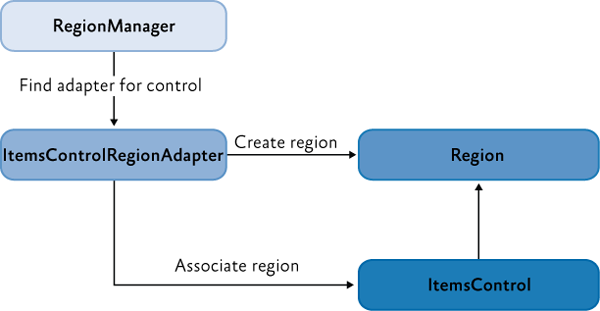
The RegionManager can create regions in code or in XAML. The RegionManager.RegionName attached property is used to create a region in XAML by applying the attached property to the host control.
Applications can contain one or more instances of a RegionManager. You can specify the RegionManager instance into which you want to register the region. This is useful if you want to move the control around in the visual tree and do not want the region to be cleared when the attached property value is removed.
The RegionManager provides a RegionContext attached property that permits its regions to share data.
Region Implementation
A region is a class that implements the IRegion interface. The term region represents a container that can hold dynamic data that is presented in a UI. A region allows the Prism Library to place dynamic content contained in modules in predefined placeholders in a UI container.
Regions can hold any type of UI content. A module can contain UI content presented as a user control, a data type that is associated with a data template, a custom control, or any combination of these. This lets you define the appearance for the UI areas and then have modules place content in these predetermined areas.
A region can contain zero or more items. Depending on the type of host control the region is managing, one or more of the items could be visible. For example, a ContentControl can display only a single object. However, the region in which it is located can contain many items, and an ItemsControl can display multiple items. This allows each item in the region to be visible in the UI.
In the following illustration, the sample app shell contains four regions: MainRegion, MainToolbarRegion, ResearchRegion, and ActionRegion. These regions are populated by the various modules in the application—the content can be changed at any time.
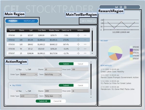
Module User Control to Region Mapping
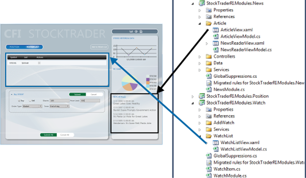
To demonstrate how modules and content are associated with regions, see the following illustration. It shows the association of WatchModule and the NewsModule with the corresponding regions in the shell.
The MainRegion contains the WatchListView user control, which is contained in the WatchModule. The ResearchRegion also contains the ArticleView user control, which is contained in the NewsModule.
In applications created with the Prism Library, mappings like this will be a part of the design process because designers and developers use them to determine what content is proposed to be in a specific region. This allows designers to determine the overall space needed and any additional items that must be added to ensure that the content will be viewable in the allowable space.
Default Region Functionality
While you do not need to fully understand region implementations to use them, it might be useful to understand how controls and regions are associated and the default region functionality: for example, how a region locates and instantiates views, how views can be notified when they are the active view, or how view lifetime can be tied to activation.
The following sections describe the region adapter and region behaviors.
Region Adapter
To expose a UI control as a region, it must have a region adapter. Region adapters are responsible for creating a region and associating it with the control. This allows you to use the IRegion interface to manage the UI control contents in a consistent way. Each region adapter adapts a specific type of UI control. The Prism Library provides the following three region adapters:
ContentControlRegionAdapter. This adapter adapts controls of typeSystem.Windows.Controls.ContentControland derived classes.SelectorRegionAdapter. This adapter adapts controls derived from the classSystem.Windows.Controls.Primitives.Selector, such as theSystem.Windows.Controls.TabControlcontrol.ItemsControlRegionAdapter. This adapter adapts controls of typeSystem.Windows.Controls.ItemsControland derived classes.
Region Behaviors
The Prism Library introduces the concept of region behaviors. These are pluggable components that give a region most of its functionality. Region behaviors were introduced to support view discovery and region context (described later in this topic). Additionally, behaviors provide an effective way to extend a region's implementation.
A region behavior is a class that is attached to a region to give the region additional functionality. This behavior is attached to the region and remains active for the lifetime of the region. For example, when an AutoPopulateRegionBehavior is attached to a region, it automatically instantiates and adds any ViewTypes that are registered against regions with that name. For the lifetime of the region, it keeps monitoring the RegionViewRegistry for new registrations. It is easy to add custom region behaviors or replace existing behaviors, either on a system-wide or a per-region basis.
The next sections describe the default behaviors that are automatically added to all regions. One behavior, the SelectorItemsSourceSyncBehavior, is only attached to controls that derive from the Selector.
Registration Behavior
The RegionManagerRegistrationBehavior is responsible for making sure that the region is registered to the correct RegionManager. When a view or control is added to the visual tree as a child of another control or region, any region defined in the control should be registered in the RegionManager of the parent control. When the child control is removed, the registered region is unregistered.
Auto-Population Behavior
There are two classes responsible for implementing view discovery. One of them is the AutoPopulateRegionBehavior. When it is attached to a region, it retrieves all view types that are registered under the name of the region. It then creates instances of those views and adds them to the region. After the region is created, the AutoPopulateRegionBehavior monitors the RegionViewRegistry for any newly registered view types for that region name.
If you want to have more control over the view discovery process, consider creating your own implementation of the IRegionViewRegistry and the AutoPopulateRegionBehavior.
Region Context Behaviors
The region context functionality is contained within two behaviors: the SyncRegionContextWithHostBehavior and the BindRegionContextToDependencyObjectBehavior. These behaviors are responsible for monitoring changes to the context that were made on the region, and then synchronizing the context with a context dependency property attached to the view.
Activation Behavior
The RegionActiveAwareBehavior is responsible for notifying a view if it is active or inactive. The view must implement IActiveAware to receive these change notifications. This active aware notification is one-directional (it travels from the behavior to the view). The view cannot affect its active state by changing the active property on the IActiveAware interface.
Region Lifetime Behavior
The RegionMemberLifetimeBehavior is responsible for determining if an item should be removed from the region when it is deactivated. The RegionMemberLifetimeBehavior monitors the region's ActiveViews collection to discover items that transition into a deactivated state. The behavior checks the removed items for IRegionMemberLifetime or the RegionMemberLifetimeAttribute (in that order) to determine if it should be kept alive on removal.
If the item in the collection is a System.Windows.FrameworkElement, it will also check its DataContext for IRegionMemberLifetime or the RegionMemberLifetimeAttribute.
The region items are checked in the following order:
IRegionMemberLifetime.KeepAlivevalueDataContext'sIRegionMemberLifetime.KeepAlivevalueRegionMemberLifetimeAttribute.KeepAlivevalueDataContext'sRegionMemberLifetimeAttribute.KeepAlivevalue
Control-Specific Behaviors
The SelectorItemsSourceSyncBehavior is used only for controls that derive from Selector, such as a tab control in WPF. It is responsible for synchronizing the views in the region with the items of the selector, and then synchronizing the active views in the region with the selected items of the selector.
Extending the Region Implementation
The Prism Library provides extension points that allow you to customize or extend the default behavior of the provided APIs. For example, you can write your own region adapters, region behaviors, or change the way the Navigation API parses URIs.
View Composition
View composition is the constructing of a view. In composite applications, views from multiple modules have to be displayed at run time in specific locations within the application UI. To achieve this, you need to define the locations where the views will appear and how the views will be created and displayed in those locations.
Views can be created and displayed in the locations either automatically through view discovery, or programmatically through view injection. These two techniques determine how individual views are mapped to named locations within the application UI.
View Discovery
In view discovery, you set up a relationship in the RegionViewRegistry between a region's name and the type of a view. When a region is created, the region looks for all the ViewTypes associated with the region and automatically instantiates and loads the corresponding views. Therefore, with view discovery, you do not have explicit control over when the views that correspond to a region are loaded and displayed.
View Injection
In view injection, your code obtains a reference to a region, and then programmatically adds a view into it. Typically, this is done when a module initializes or as a result of a user action. Your code will query a RegionManager for a specific region by name and then inject views into it. With view injection, you have more control over when views are loaded and displayed. You also have the ability to remove views from the region. However, with view injection, you cannot add a view to a region that has not yet been created.
Navigation
The Prism Library 8 contains Navigation APIs. The Navigation APIs simplify the view injection process by allowing you to navigate a region to an URI. The Navigation API instantiates the view, adds it to the region, and then activates it. Additionally, the Navigation API allows navigating back to a previously created view contained in a region. For more information about the Navigation APIs, see Basic Region Navigation.
When to Use View Discovery vs. View Injection
Choosing which view loading strategy to use for a region depends on the application requirements and the function of the region.
Use view discovery in the following situations:
- Automatic view loading is desired or required.
- Single instances of a view will be loaded into the region.
Use view injection in the following situations:
- Your application uses the Navigation APIs.
- You need explicit or programmatic control over when a view is created and displayed, or you need to remove a view from a region; for example, as a result of application logic or navigation.
- You need to display multiple instances of the same views in a region, where each view instance is bound to different data.
- You need to control which instance of a region a view is added to. For example, you want to add a customer detail view to a specific customer detail region. (This scenario requires implementing scoped regions as described later in this topic.)
UI Layout Scenarios
In composite applications, views from multiple modules are displayed at run time in specific locations within the application UI. To achieve this, you need to define the locations where the views will appear and how the views will be created and displayed in those locations.
The decoupling of the view and the location in the UI in which it will be displayed allows the appearance and layout of the application to evolve independently of the views that appear within the region.
The next sections describe the core scenarios you will encounter when you develop a composite application.
Implementing the Shell
The shell is the application root object in which the primary UI content is contained. In a WPF application, the shell is the Window object.
A shell can contain named regions where modules can specify the views that will appear. It can also define certain top-level UI elements, such as the main menu and toolbar. The shell defines the overall structure and appearance for the application, and is similar to an ASP.NET master page control. It could define styles and borders that are present and visible in the shell layout itself, and it could also define styles, templates, and themes that are applied to the views that are plugged into the shell.
You do not need to have a distinct shell as part of your application architecture to use the Prism Library. If you are building a completely new composite application, implementing a shell provides a well-defined root and initialization pattern for setting up the main UI of your application. However, if you are adding Prism Library features to an existing application, you do not have to change the basic architecture of your application to add a shell. Instead, you can alter your existing window definitions or controls to add regions that can pull in views as needed.
You can also have more than one shell in your application. If your application is designed to open more than one top-level window for the user, each top-level window acts as shell for the content it contains.
Sample Shell
This sample has a shell as its main window. In the following illustration, the shell and views are highlighted. The shell is the main window that appears when the app starts and which contains all the views. It defines the regions into which modules add their views and a couple of top-level UI items, including the title and the Watch List tear-off banner.

The shell implementation in the app is provided by Shell.xaml, its code-behind file Shell.xaml.cs, and its view model ShellViewModel.cs. Shell.xaml includes the layout and UI elements that are part of the shell, including definitions of regions to which modules add their views.
The following XAML shows the structure and main XAML elements that define the shell. Notice that the RegionName attached property is used to define the four regions and that the window background image provides a background for the shell.
<!--Shell.xaml (WPF) -->
<Window x:Class="StockTraderRI.Shell">

    <!--shell background -->
    <Window.Background>
        <ImageBrush ImageSource="Resources/background.png" Stretch="UniformToFill"/>
    </Window.Background>

    <Grid>

        <!-- logo -->
        <Canvas x:Name="Logo" ...>
            <TextBlock Text="CFI" ... />
            <TextBlock Text="STOCKTRADER" .../>
        </Canvas>

        <!-- main bar -->
        <ItemsControl
            x:Name="MainToolbar"
            prism:RegionManager.RegionName="{x:Static inf:RegionNames.MainToolBarRegion}"/>

        <!-- content -->
        <Grid>
            <Controls:AnimatedTabControl
                x:Name="PositionBuySellTab"
                prism:RegionManager.RegionName="{x:Static inf:RegionNames.MainRegion}"/>
        </Grid>

        <!-- details -->
        <Grid>
            <ContentControl
                x:Name="ActionContent"
                prism:RegionManager.RegionName="{x:Static inf:RegionNames.ActionRegion}"/>
        </Grid>

        <!-- sidebar -->
        <Grid x:Name="SideGrid">
            <Controls:ResearchControl
                prism:RegionManager.RegionName="{x:Static inf:RegionNames.ResearchRegion}" />
        </Grid>

    </Grid>
</Window>
The implementation of the Shell code-behind file is very simple. The Shell is exported so that when your App object creates it, its dependencies will be added.
// Shell.xaml.cs
[Export]
public partial class Shell : Window
{
    public Shell()
    {
        InitializeComponent();
    }
}
The minimal code in the code-behind file illustrates the power and simplicity of the composite application architecture and loose coupling between the shell and its constituent views.
Defining Regions
You define where views will appear by defining a layout with named locations, known as regions. Regions act as placeholders for one or more views that will be displayed at run time. Modules can locate and add content to regions in the layout without knowing how and where the region is displayed. This allows the layout to change without affecting the modules that add the content to the layout.
Regions are defined by assigning a region name to a WPF control, either in XAML as shown in the previous Shell.xaml file or in code. Regions can be accessed by their region name. At run time, views are added to the named Region control, which then displays the view or views according to the layout strategy that the views implement. For example, a tab control region will lay out its child views in a tabbed arrangement. Regions support the addition or removal of views. Views can be created and displayed in regions either programmatically or automatically. In the Prism Library, the former is achieved through view injection and the latter through view discovery. These two techniques determine how individual views are mapped to the named regions within the application UI.
The shell of the application defines the application layout at the highest level; for example, by specifying the locations for the main content and the navigation content, as shown in the following illustration. Layout within these high-level views is similarly defined, allowing the overall UI to be recursively composed.
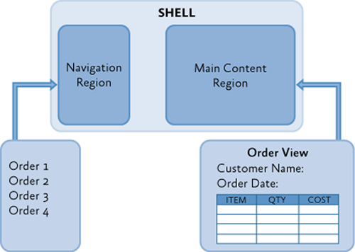
Regions are sometimes used to define locations for multiple views that are logically related. In this scenario, the region control is typically an ItemsControl-derived control that will display the views according to the layout strategy that it implements, such as in a stacked or tabbed layout arrangement.
Regions can also be used to define a location for a single view; for example, by using a ContentControl. In this scenario, the region control displays only one view at a time, even if more than one view is mapped to that region location.
Sample App Shell Regions

A multiple-view layout is also demonstrated in the example app ui when the application is buying or selling a stock. The Buy/Sell area is a list-style region that shows multiple buy/sell views (OrderCompositeView) as part of its list, as shown in the following illustration.
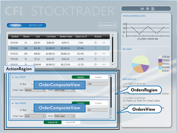
The shell's ActionRegion contains the OrdersView. The OrdersView contains the Submit All and Cancel All buttons as well as the OrdersRegion. The OrdersRegion is attached to a ListBox control which displays multiple OrderCompositeViews.
Adding a Region in XAML
A region is a class that implements the IRegion interface. The region is the container that holds content to be displayed by a control.
The RegionManager supplies an attached property that you can use for simple region creation in XAML. To use the attached property, you must load the Prism Library namespace into the XAML and then use the RegionName attached property. The following example shows how to use the attached property in a window with an AnimatedTabControl.
Notice the use of the x:Static markup extension to reference the MainRegion string constant. This practice eliminates magic strings in the XAML.
<!-- (WPF) -->
<Controls:AnimatedTabControl
    x:Name="PositionBuySellTab"
    prism:RegionManager.RegionName="{x:Static inf:RegionNames.MainRegion}"/>
Adding a Region by Using Code
The RegionManager can register regions directly without using XAML. The following code example shows how to add a region to a control from the code-behind file. First a reference to the region manager is obtained. Then, using the RegionManager static methods SetRegionManager and SetRegionName, the region is attached to the UI's ActionContent control and then that region is named ActionRegion.
IRegionManager regionManager = ServiceLocator.Current.GetInstance<IRegionManager>();
RegionManager.SetRegionManager(this.ActionContent, regionManager);
RegionManager.SetRegionName(this.ActionContent, "ActionRegion");
Displaying Views in a Region When the Region Loads
With the view discovery approach, modules can register views (view models or presentation models) for a specific named location. When that location is displayed at run time, any views that have been registered for that location will be created and displayed within it automatically.
Modules register views with a registry. The parent view queries this registry to discover the views that were registered for a named location. After they are discovered, the parent view places those views on the screen by adding them to the placeholder control.
After the application is loaded, the composite view is notified to handle the placement of new views that have been added to the registry.
The following illustration shows the view discovery approach.
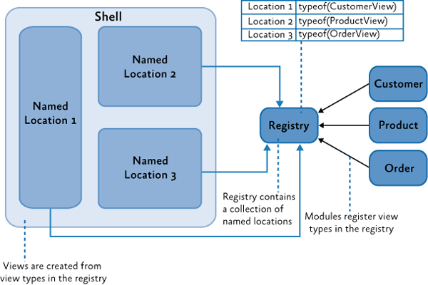
The Prism Library defines a standard registry, RegionViewRegistry, to register views for these named locations.
To show a view in a region, register the view with the region manager, as shown in the following code example. You can directly register a view type with the region, in which case the view will be constructed by the dependency injection container and added to the region when the control hosting the region is loaded.
// View discovery
this.regionManager.RegisterViewWithRegion("MainRegion", typeof(EmployeeView));
Optionally, you can provide a delegate that returns the view to be shown, as shown in the next example. The region manager will display the view when the region is created.
// View discovery
this.regionManager.RegisterViewWithRegion("MainRegion", () => this.container.Resolve<EmployeeView>());
Displaying Views in a Region Programmatically
In the view injection approach, views are programmatically added or removed from a named location by the modules that manage them. To enable this, the application contains a registry of named locations in the UI. A module can use the registry to look up one of the locations and then programmatically inject views into it. To make sure that locations in the registry can be accessed similarly, each of the named locations adheres to a common interface used to inject the view. The following illustration shows the view injection approach.
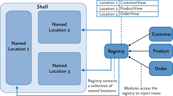
The Prism Library defines a standard registry, RegionManager, and a standard interface, IRegion, for access these locations.
To use view injection to add a view to a region, get the region from the region manager, and then call the Add method, as shown in the following code. With view injection, the view is displayed only after the view is added to a region, which can happen when the module is loaded or when a user action completes a predefined action.
// View injection
IRegion region = regionManager.Regions["MainRegion"];

var ordersView = container.Resolve<OrdersView>();
region.Add(ordersView, "OrdersView");
region.Activate(ordersView);
Ordering Views in a Region
Whether it uses view discovery or view Injection, an application might need to order how views appear in a TabControl, ItemsControl, or any other control that displays multiple active views. By default, views appear in the order that they were registered and added into the region.
When a composite application is built, views are often registered from different modules. Declaring dependencies between modules can help alleviate the problem, but when modules and views do not have any real interdependencies, declaring an artificial dependency couples modules unnecessarily.
To allow views to participate in ordering themselves, the Prism Library provides the ViewSortHint attribute. This attribute contains a string Hint property that allows a view to declare a hint of how it should be ordered in the region.
When displaying views, the Region class uses a default view sorting routine that uses the hint to order the views. This is a simple case-sensitive ordinal sort. Views that have the sort hint attribute are ordered ahead of those without. Also, those without the attribute appear in the order they were added to the region.
If you want to change how views are ordered, the Region class provides a SortComparison property that you can set with your own Comparison<_object_> delegate method. It is important to note that the ordering of the region's Views and ActiveViews properties are reflected in the UI because adapters such as the ItemsControlRegionAdapter bind directly to these properties. A custom region adapter could implement its own sorting and filter that will override how the region orders views.
Sharing Data Between Multiple Regions
The Prism Library provides multiple approaches to communicating between views, depending on your scenario. The region manager provides the RegionContext property as one of these approaches.
RegionContext is useful when you want to share context between a parent view and child views that are hosted in a region. RegionContext is an attached property. You set the value of the context on the region control so that it can be made available to all child views that are displayed in that region control. The region context can be any simple or complex object and can be a data-bound value. The RegionContext can be used with either view discovery or view injection.
Note: The
DataContextproperty in WPF is used to set the local data context for the view. It allows the view to use data binding to communicate with a view model, local presenter, or model.RegionContextis used to share context between multiple views and is not local to a single view. It provides a simple mechanism for sharing context between multiple views.
The following code shows how the RegionContext attached property is used in XAML.
<TabControl AutomationProperties.AutomationId="DetailsTabControl"
    prism:RegionManager.RegionName="{x:Static local:RegionNames.TabRegion}"
    prism:RegionManager.RegionContext="{Binding Path=SelectedEmployee.EmployeeId}"
...>
You can also set the RegionContext in code, as shown in the following example.
RegionManager.Regions["Region1"].Context = employeeId;
To retrieve the RegionContext in a view, the GetObservableContext static method of the RegionContext class is used. It passes the view as a parameter and then accesses its Value property, as shown in the following code example.
private void GetRegionContext()
{
    this.Model.EmployeeId = (int)RegionContext.GetObservableContext(this).Value;
}
The value of the RegionContext can be changed from within a view by simply assigning a new value to its Value property. Views can opt to be notified of changes to the RegionContext by subscribing to the PropertyChanged event on the ObservableObject that is returned by the GetObservableContext method. This allows multiple views to be kept in synchronization when their RegionContext is changed. The following code example demonstrates subscribing to the PropertyChanged event.
ObservableObject<object> viewRegionContext =
                RegionContext.GetObservableContext(this);
viewRegionContext.PropertyChanged += this.ViewRegionContext_OnPropertyChangedEvent;

private void ViewRegionContext_OnPropertyChangedEvent(object sender,
                    PropertyChangedEventArgs args)

{
    if (args.PropertyName == "Value")
    {
        var context = (ObservableObject<object>) sender;
        int newValue = (int)context.Value;
    }
}
Note: The
RegionContextis set as an attached property on the content object hosted in the region. This means that the content object has to derive fromDependencyObject. In the preceding example, the view is a visual control, which ultimately derives fromDependencyObject.
If you choose to use WPF data templates to define your view, the content object will represent the
ViewModelorPresentationModel. If your view model or presentation model needs to retrieve theRegionContext, it will need to derive from theDependencyObjectbase class.
Creating Multiple Instances of a Region
Scoped regions are available only with view injection. You should use them if you need a view to have its own instance of a region. Views that define regions with attached properties automatically inherit their parent's RegionManager. Usually, this is the global RegionManager that is registered in the shell window. If the application creates more than one instance of that view, each instance would attempt to register its region with the parent RegionManager. RegionManager allows only uniquely named regions; therefore, the second registration would produce an error.
Instead, use scoped regions so that each view will have its own RegionManager and its regions will be registered with that RegionManager rather than the parent RegionManager, as shown in the following illustration.
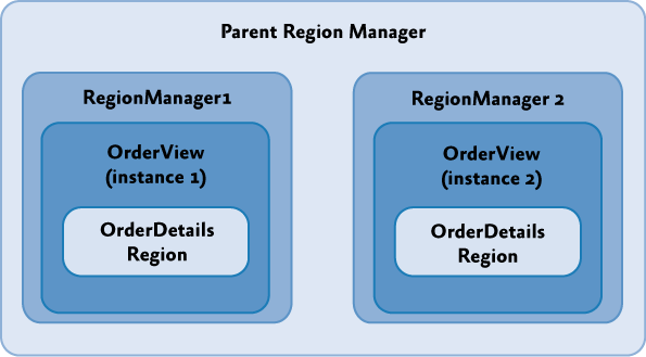
To create a local RegionManager for a view, specify that a new RegionManager should be created when you add your view to a region, as illustrated in the following code example.
IRegion detailsRegion = this.regionManager.Regions["DetailsRegion"];
View view = new View();
bool createRegionManagerScope = true;
IRegionManager detailsRegionManager = detailsRegion.Add(view, null, createRegionManagerScope);
The Add method will return the new RegionManager that the view can retain for further access to the local scope.